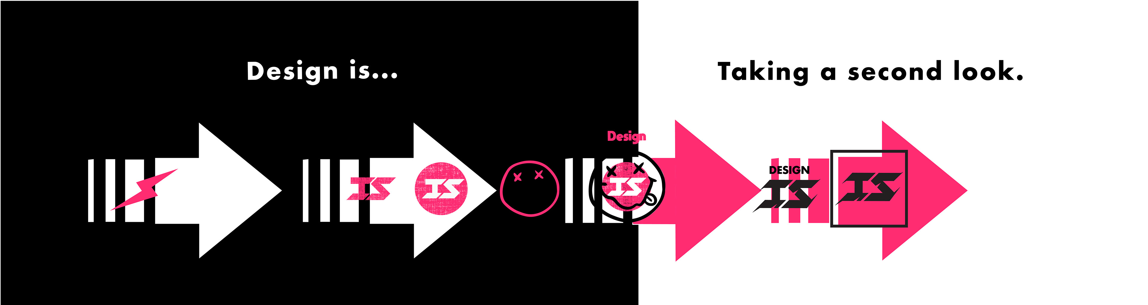
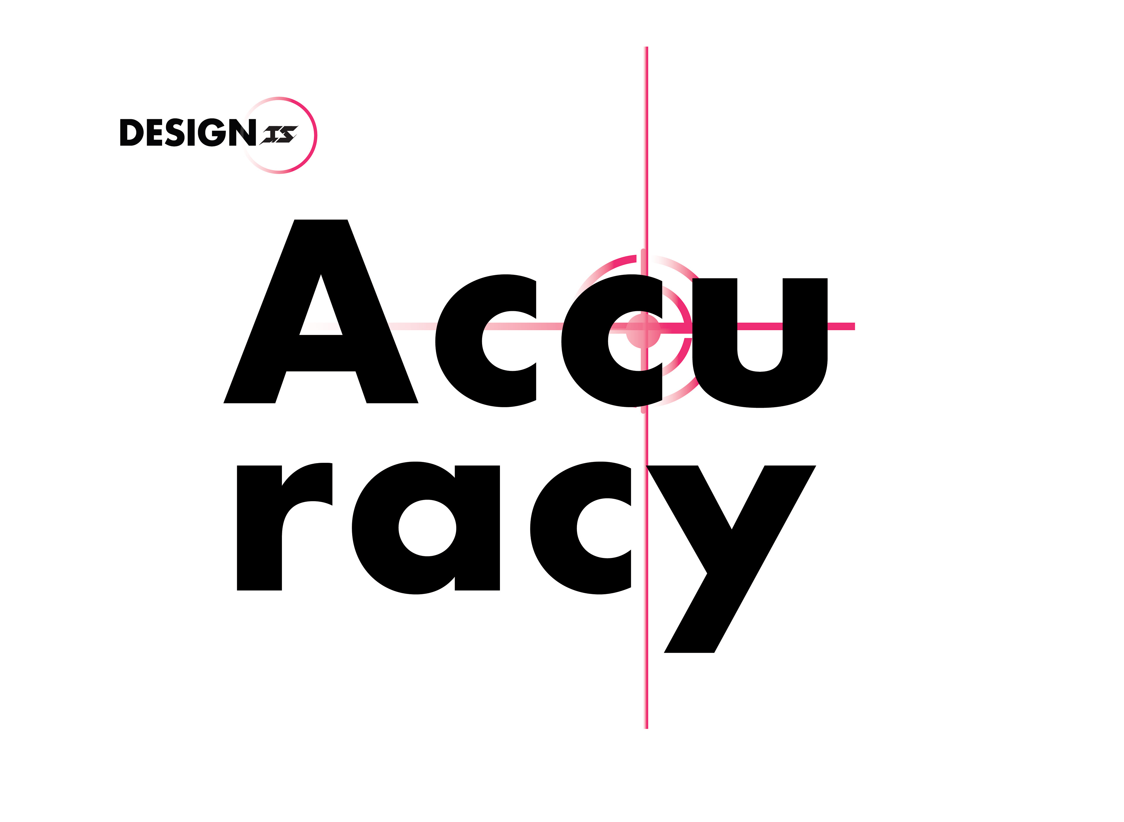
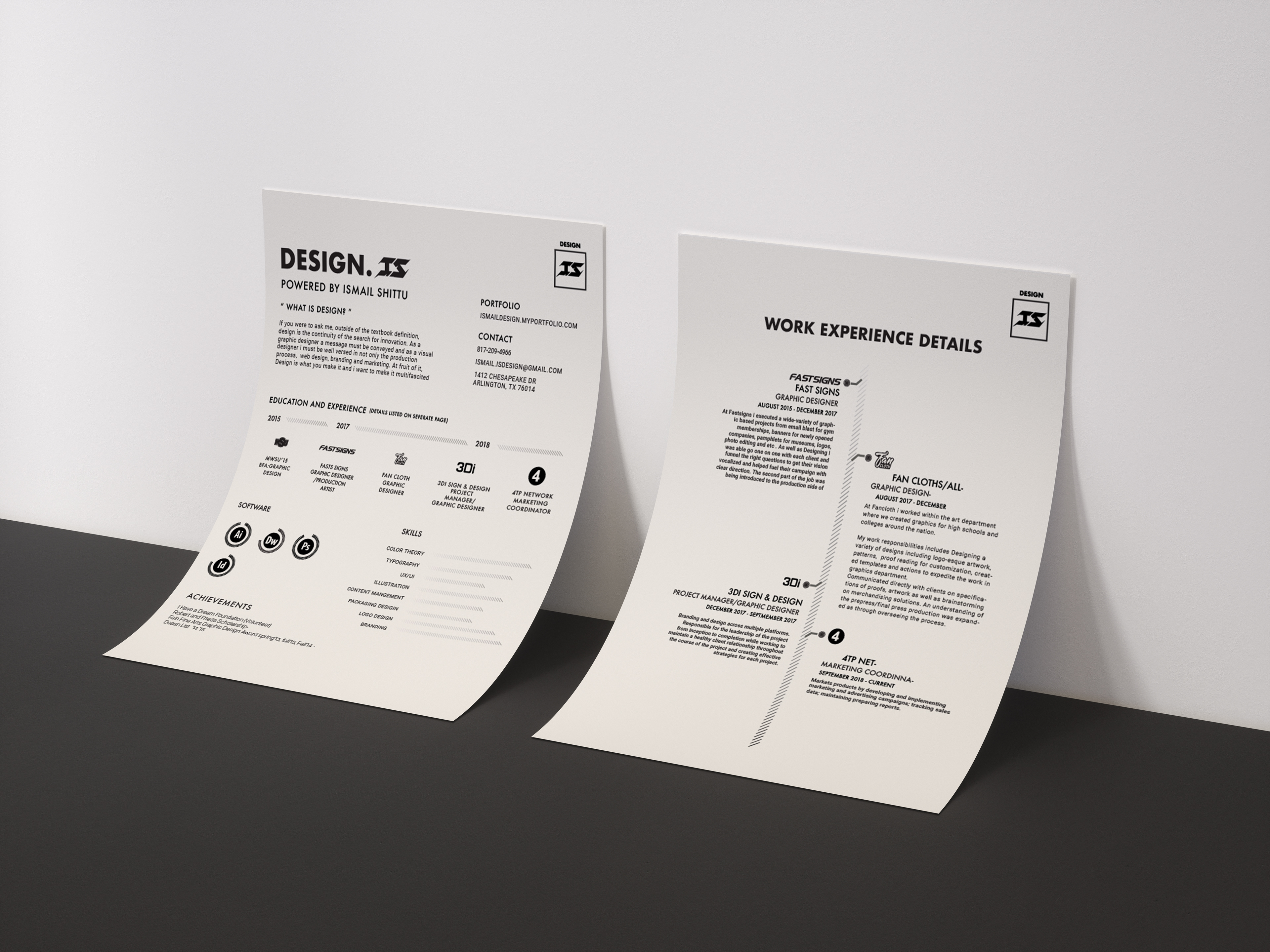
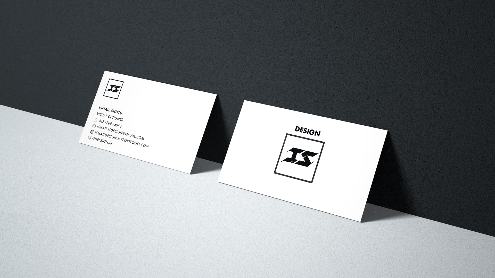
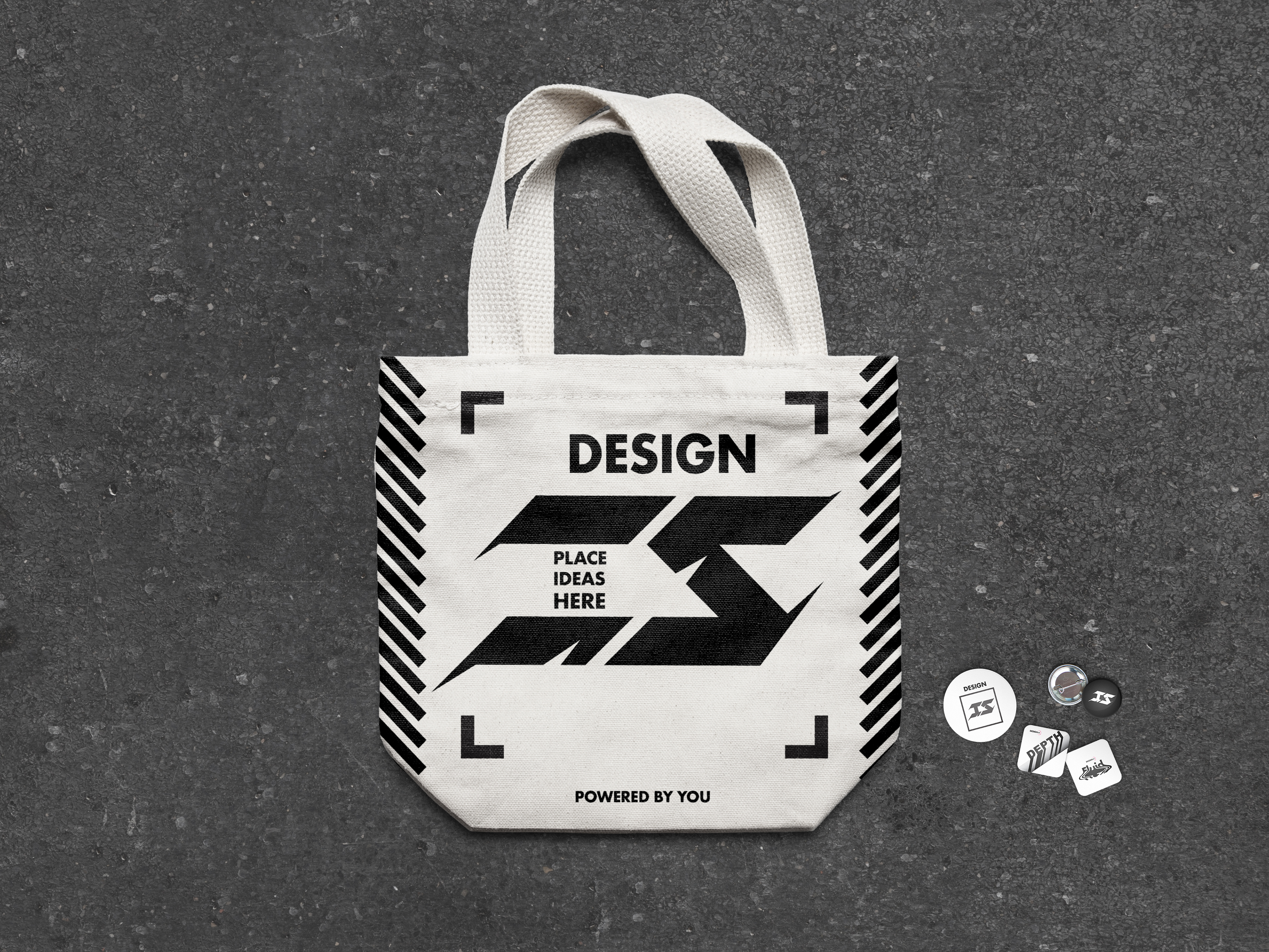
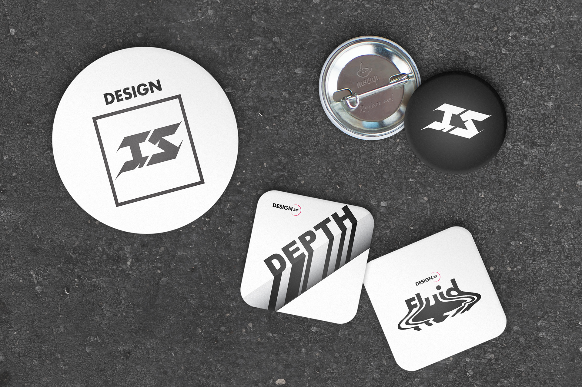
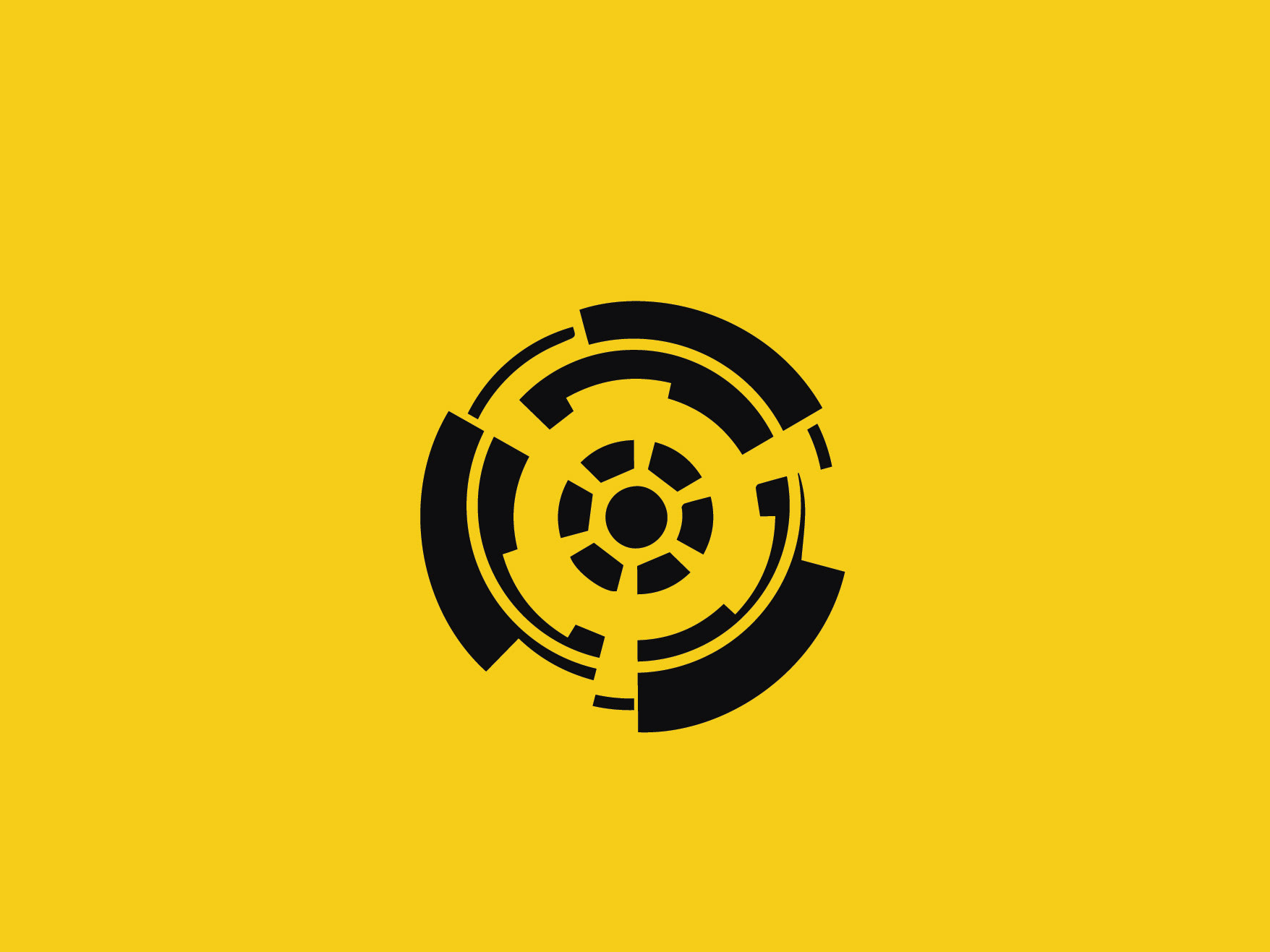
A rebranding of my creative agency to reflect the exact feelings i wanted to convey. Initially i wanted something that felt like a thunderbolt, you know? That feeling you get when innovation strikes your mind. But i also wanted character. The initial logo had too much character whereas i've realized i have grown a lot as a designer and i needed a more mature look. So as you will see in the evolution graphic i made for the brand. I ended up going back to the first iteration of the logo but adding in sharp lines to still feel reminiscent of a thunderbolt and also to symbolize precision. The branding of this agency definitely helped set the standard of the quality of work that i want to put out.